Changing the style
 Edit on GitHub
Color theme
Its time to put our webpage prettier, I don't have problems with the purple color 🍆, but I think is not our style...
I love the blue color but all my web start being almost the same so let us try something different, what if we search in google about the "color of the year"?
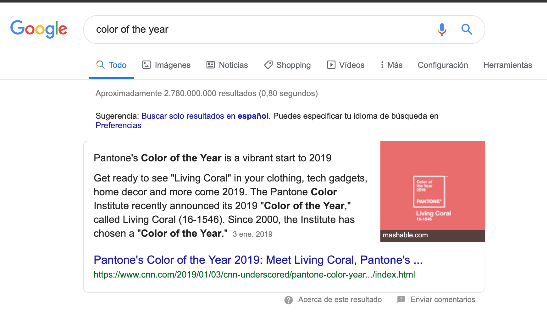
😵 WOW, this thing exits hahaha, ok so let us use the color of the year that is "Living Coral" as our inspiration.
When I work in themes, I like to first generate a color palette, I'm not too strict with colors but just to have a base to work with. An online tool that I like a lot is coolors because it is an easy way to generate random palette and adjust to your likes.
We start in the first column putting our coral #FF4040 and "locking" the color, then clicking on the space bar and colors start to change, after did this process some times we get this:
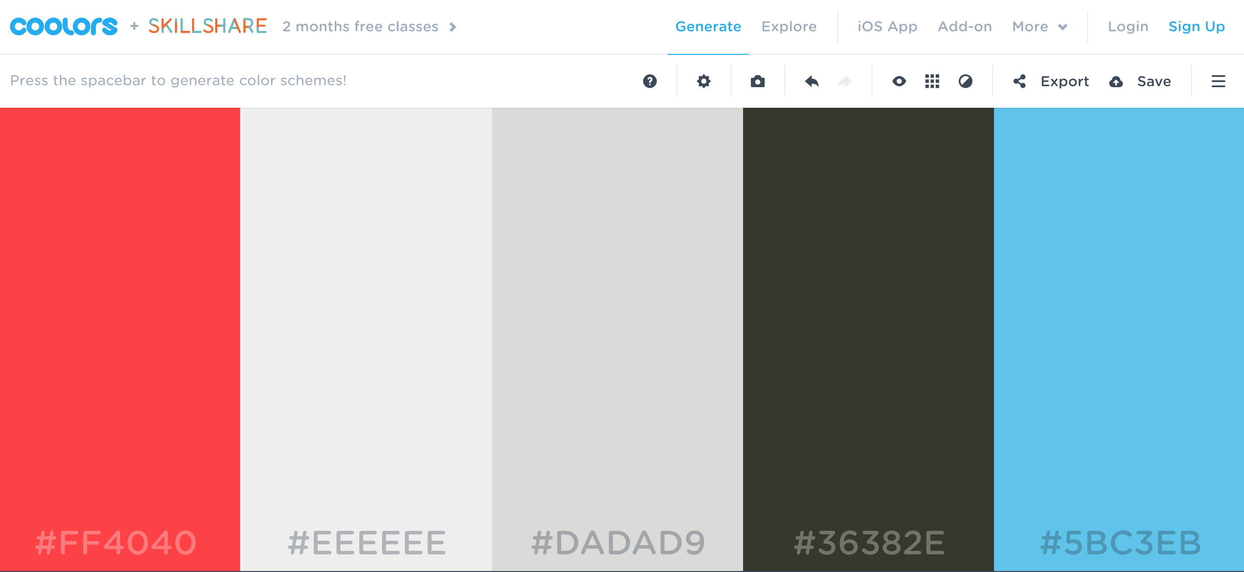
This is the link of our final palette as colors are in the URL you can share or save very quickly, isn't amazing? 🌈
Changing primary color
Our primary color then is going to be the coral #FF4040, so our header must have this color. To see where is the color defined let us use the Chrome DevTools, so just right click on the header
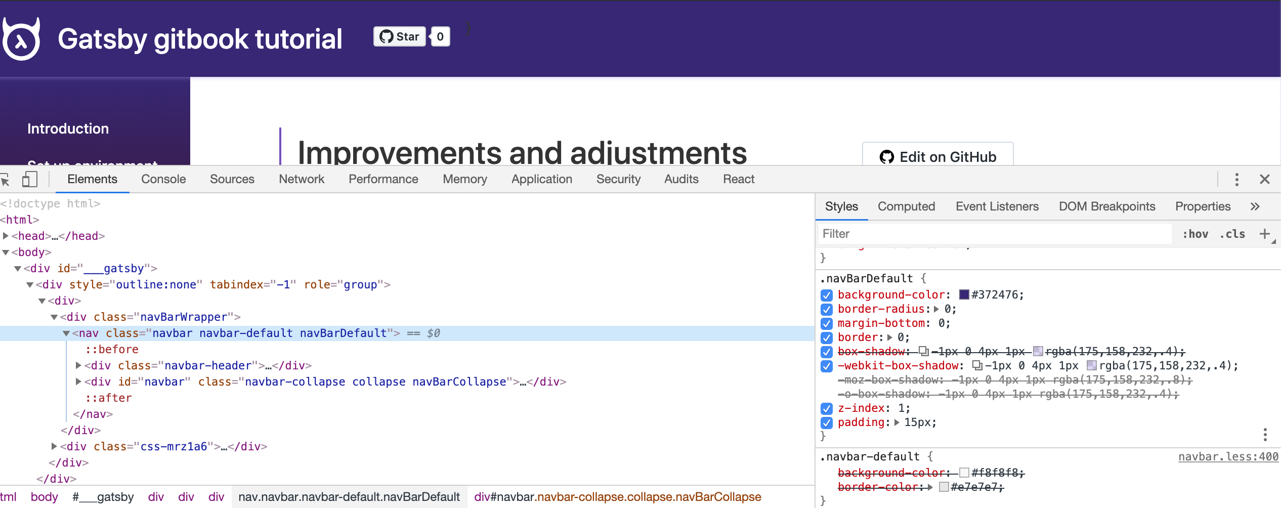
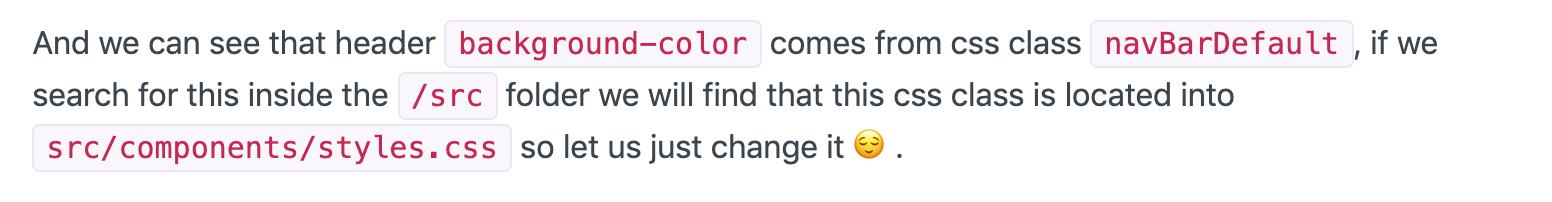
And we can see that header background-color comes from CSS class navBarDefault, if we search for this inside the /src folder we will find that this CSS class is located into src/components/styles.css file, so let us just change it 😌.
We are going to follow this process to find out all the CSS classes that we need to change, so we are not going to describe this process anymore 😉.
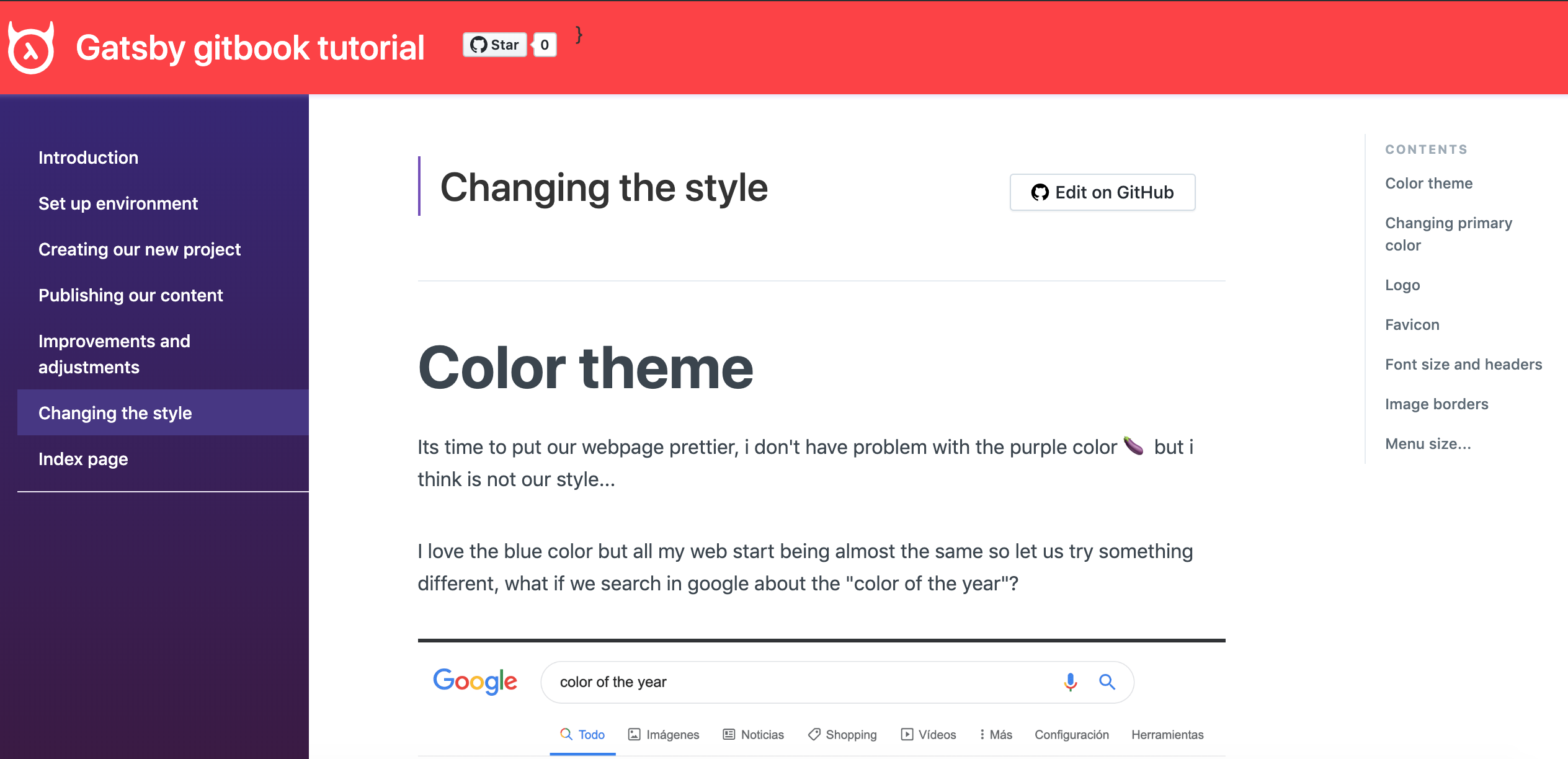
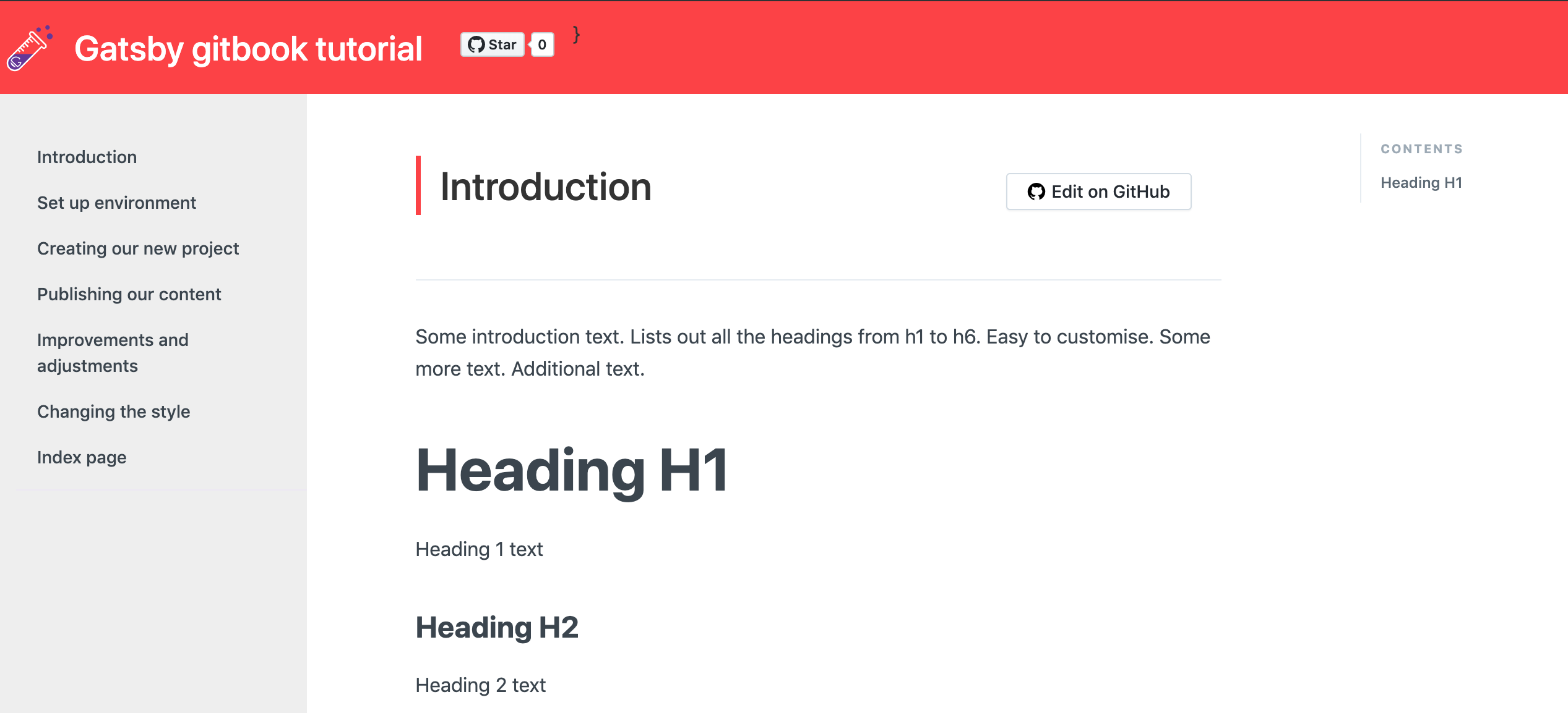
Gatsby develop server comes with "hot reload" so change sin CSS files will be updated automatically in the browser, in our case we see:
Cool!
Left menu color
In the case of the left menu I think also put a coral solor is not our style, I prefer something that makes the tutorial more readable, maybe the second color in our palette #EEE.
In this case, if we use DevTools we see a strange CSS class called css-1h18y8r umm more than sure these numbers mean that is a "compiled" style, and we confirm when try to search in the src file because got 0 results...
Well, we cannot forget that we are using gatsby and react so this should be because the style is inside the component. Just having a look to the src/component folder we see a sidebar.js file and in the code we can see some CSS code:
const Sidebar = styled('aside')`width: 100%;/* background-color: rgb(245, 247, 249); *//* border-right: 1px solid #ede7f3; */height: 100vh;overflow: auto;position: fixed;padding-left: 24px;position: -webkit-sticky;position: -moz-sticky;position: sticky;top: 0;padding-right: 0;background-color: #372476;/* Safari 4-5, Chrome 1-9 */background: linear-gradient(#372476, #3b173b);background: -webkit-gradient(linear, 0% 0%, 0% 100%, from(#372476), to(#3b173b));/* Safari 5.1, Chrome 10+ */background: -webkit-linear-gradient(top, #372476, #3b173b);/* Firefox 3.6+ */background: -moz-linear-gradient(top, #372476, #3b173b);/* IE 10 */background: -ms-linear-gradient(top, #372476, #3b173b);/* Opera 11.10+ */
The background is defined using a background-color but also there are gradients using background, in our case we want just a plain color so just add our color and remove the rest, I mean to put this background-color: #EEE and just after the change we get in browser this:
😣 umm colors of the fonts are not working with the new background, let us fix this and put the same color that we are using in the rest of the text #3b454e, to change menu text color just in the same file src/component/sidebar.js a little below in the code there is the CSS definition for links.
Better now, but still this purple color when the link is active, this is the code for this case:
${props =>props.active &&`color: #fff;background-color: #473485;`} // external link icon
We should remove the background-color and I'm going to use the primary color for the emphasis so we put color: #FF4040, this is the result:
Pretty isn't it? But wait! when we put the cursor on top of the menu options the purple color appears again 😠, this is because we forget to change the hover CSS directive, we are going to use our third color #DADAD9 and this is the final result:
How much beauty 😢.
Rest of the colors...
We have changed most visible color elements but there are other elements that still has the purple color,
- Links
<a>(CSS insrc/template/docs.js) - Links in the right menu on hover (CSS in
src/comonents/rightSidebar.js) - Line near to the page title (CSS in
src/components/styles.css) - Navigation buttons in the bottom of the page (CSS in
src/components/styles.css)
I'm not going to repeat the steps here, we just look for CSS classes using devtools and change the value in the static CSS file or dynamic classes inside components code. All this color will be replaced by our wonderfull primary color #FF4040 and also for add a little contrast, we are going to use our secondary color #5BC3EB in inline code blocks, actually has this look
And after change the css in sr/components/mdxComponents (basically adding color: #5BC3EB;) we obtain this:
Cool! 🤘
Image borders
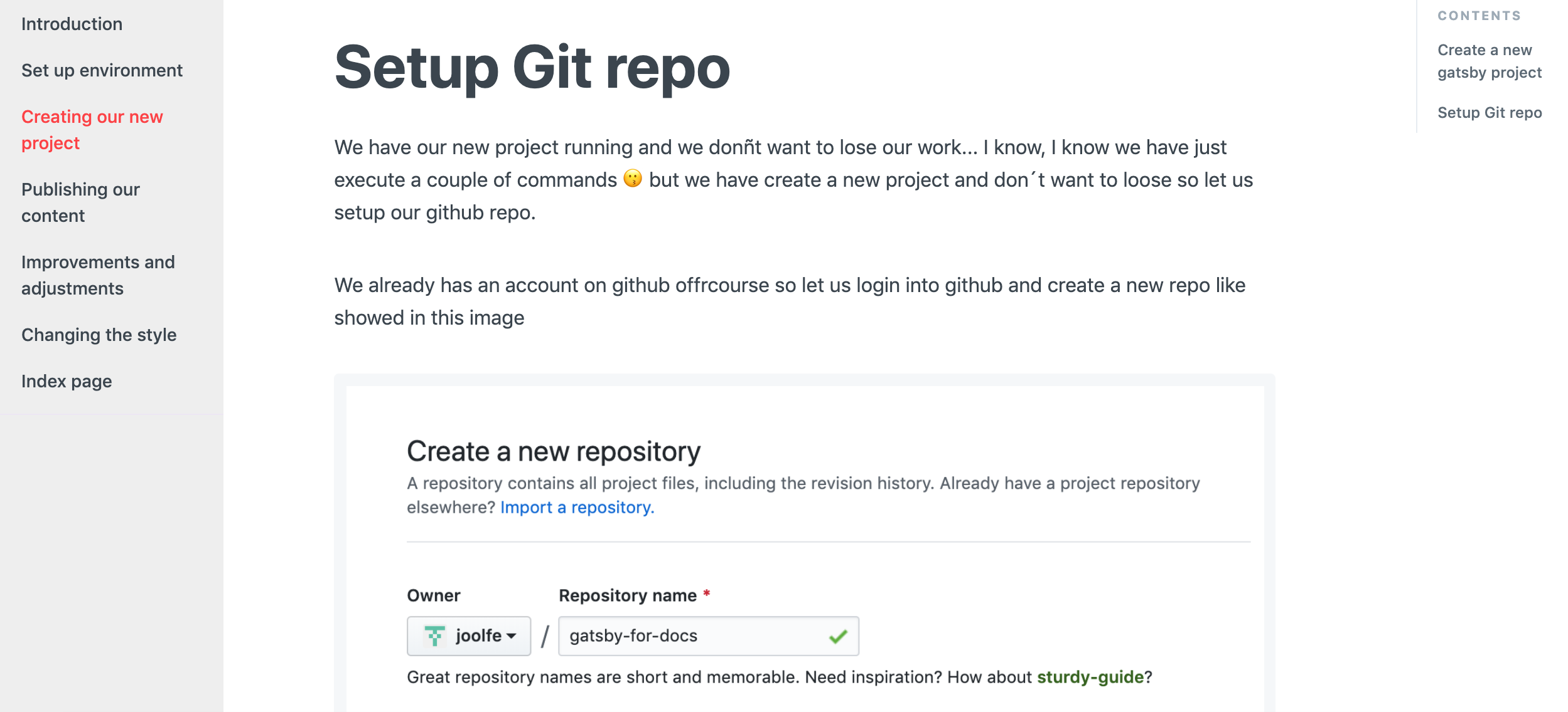
Some images in our tutorial don't look pretty well, like for example this one:

If you look carefully the GitHub form is a picture but seems part of our text 😩, to avoid this effect we are going to put a border around images, and for maintaining the style coherence we are going to use the same border that already exists in our code blocks.
We just do right click in a code block and inspect the css, the trick to do the border is very elegant, just use:
background-color: #f5f7f9;padding: 9.5px;border-radius: 4px;
So we can add into the src/componenets/styles.css file a new css rule to make all images that are inside the main body (we don't want to put a border to the logo for example 😗) have the border, this code should work:
.mainWrapper img {background-color: #f5f7f9;padding: 9.5px;border-radius: 4px;}
If we refresh in local we will see this:
Awesome! 💪
Quote panels
Other piece that we can improve are the Quote panels, I mean elements that appear when we use in markdown a quote like this:
> Hi! this is a quote :-)
In our tutorial has this style

Too much discreet for my taste, so let us put some of color to this panel, I think we can use our blue color as inspiration #5BC3EB, also add some background and fix the spacing of the component.
So we add this code into src/componenets/styles.css file:
blockquote {padding: 20px;font-size: 14.5px;border-left: 5px solid #5BC3EB;background-color: #f5f7f9;color: #6b747b;}blockquote p:first-child{margin-top: 0px;}
If we test in local we can see this

Logo
We are going to add our custom logo to the web 😊, because we are "experimenting" with gatsby I have think in merge the concept of experiment and gatsby, for experiment I have think something like a test tube and for gatsby just the logo, so the result is this:
I know, I know... I'm not a designer 😝... but this should work... ff you remember while setting up the meta we see a logo property inside config.js file, concretely in header section that looks like:
"header": {"logo": "https://graphql-engine-cdn.hasura.io/img/hasura_icon_white.sv","title": "Gatsby gitbook tutorial","githubUrl": "https://github.com/joolfe/gatsby-for-docs","helpUrl": "","tweetText": "","links": [{ "text": "", "link": ""}],}
Ummm... but this logo is an outside resource... we want to use a logo in svg format and the resource will be inside our files 😕. Let's have a look to the code that print the logo (remeber using DevTool...), we get this:
<a aria-current="page" class="navbar-brand navBarBrand" href="/gatsby-for-docs/"><img class="img-responsive" src="https://graphql-engine-cdn.hasura.io/img/hasura_icon_white.svg" alt="logo">Gatsby gitbook tutorial</a>
So we search in our files for the CSS class navbar-brand navBarBrand, we easily find that is inside file src/components/Header.js, ok makes sense hehehe. The code that print the logo is this one:
<Link to="/" className={'navbar-brand navBarBrand'}>{logo !== '' ?(<img className={'img-responsive'} src={logo} alt={'logo'} />):(<img className={'img-responsive'} src={logoImg} alt={'logo'} />)}{headerTitle}</Link>
Is very easy to understand, if in the config we have the logo parameter filled then this value is used, if not then use {logoImg}, just in same file a little early we found the definition of this variable const logoImg = require('./images/logo.svg');, so basically is using a static resource inside folder src/images, that's great because is exactly what we need 😏.
So to use our logo we just copy our SVG image into src/images folder and put an empty value for logo field in config.js file. Time to test in local with $ gatsby develop and go to the browser to found:
Wow our logo is there, but... for my taste is very small and is too near to left side, we can adjust this with some css code inside src/components/style.css like this:
.navBarBrand img {width: 50px;margin-right: 10px;margin-left: 30px;display: inline-block;}
And the result is just perfect 😃